FUNDAMENTALS OF COLOR
In this unit, we will explore thoroughly the essential elements of the painting, the different types of paints available and we will guide you in the selection of the most appropriate medium for your needs. We will deepen in color theory, drawing out its components and classifications. This understanding will enable you to manipulate and create color palettes effective in your work.
We will address the fundamental techniques of mixing and blending colors, as well as the key skills needed for the paint, getting ready in a comprehensive manner to face your art projects with confidence and creativity. Armed with this knowledge solid, you'll be ready to conceive paintings are visually striking and expressive in the rest of the course. ¡We hope that you enjoy and make the most of this stage of your artistic development!
Study the Basics of the Color and Practical Tools in a painting course is essential for several key reasons:
Basic elements of the painting
Painting is a form of artistic expression that uses pigments and a means for capturing images on a surface. The basic elements of the painting are fundamental to the creation of works of visual impact. Here are the key elements:
Color: The color is one of the most important elements in the painting. The artists use a palette of colours to convey emotions, and to set the atmosphere and create contrasts. Color theory also plays a crucial role in the combination of colors effectively.
Shape: The form refers to the dimensions and contours of the objects in the painting. It can be geometric or organic and contributes to the visual composition of the work.
Línea: The lines are visual elements that can be used to delineate forms, create contours or transmit movement. They can be straight, curved, long or short, and play an important role in the structure of the work.
Texture: Texture refers to the appearance of the tactile surface in paint. It can be smooth, rough, rough or detailed, and adds visual interest and tactile to the work.
Space: The space in the painting refers to the sense of depth and distance between the elements. Artists use techniques such as perspective and overlap to create the illusion of three-dimensional space on a two dimensional surface.
Value: The value refers to the light and the darkness of the colors in a painting. The contrasts of value are essential to create depth and define forms in a work.
Ratio: The proportion refers to the relationship between the different elements in a work. A good management of the proportion it contributes to the visual harmony and prevents unwanted "noise".
Balance: Balance is the visual distribution of the weight and the importance of the elements in a painting. Can be symmetrical, asymmetrical or radial, and contributes to the visual stability of the work.
Contrast: Contrast refers to the differences between the elements, whether in color, value, shape, or size. The contrast adds interest and emphasizes certain aspects of the work.
Movement: The movement refers to the feeling of fluidity and direction in a painting. Can be achieved through diagonal lines, curves, or by using the strategic placement of elements.
These basic elements of the painting are combined in various ways to create visual compositions unique and expressive. Each artist can interpret and use these items in a personal way, which gives rise to a wide variety of styles and approaches to the art world.
Types of paints
Video support thanks to the channel “Diego Fernandez – Renewing with Ideas”
BRUSH TYPES I. Brushes for oil and acrylic
Video support thanks to the channel of the “Teacher Marta Ferreras”
Color theory

Color theory
Color Theory encompasses a set of principles that govern the combination of colors in order to achieve desired effects. This concept is essential in a variety of disciplines visual or graphic design, painting, photography, print, and television.
There is not a single Theory of the color, but several approaches come from art history, physics (optics) and various authors. One example is the proposal of Johann Wolfgang von Goethe, in his work "Theory of colours", in 1810, where he presents a circle of colour influenced by the studies of Isaac Newton. Another case is relevant is that of Wilhelm Ostwald, a chemist and German philosopher.
A key element in any Theory of colour is the colour circle, a representation circular of all the colors of the visual spectrum. In this arrangement, the colours opposite face, and complementary are located close to each other. The chromatic circle facilitates the identification of primary colors pure and mixtures thereof.
Within these studies of color, each color is characterized by different properties, such as the hue (or chroma), which refers to the color itself, allowing to distinguish one from another. The brightness (or value) indicates the amount of light present in the color, determining whether it is more light or dark. Finally, the saturation is related to the purity of the color, indicating the concentration of gray present in a specific time. The greater number of gray, the lower the saturation, resulting in a color that looks dirty or opaque.
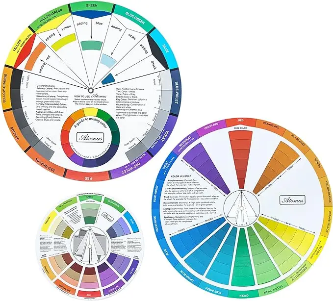
Purchase this product
Mcbazel Wheel 3 guides you to blend colors, learning guide mixing paint, tool, class teaching art to makeup, table, mix, mixed colors (3 sizes)
- Guide to mix colors: the front side of the color wheel shows the basic principles. Simply spin the wheel and you'll find the results of mixing colors on the window. The back indicates the relationships of color, such as complementary colors and colors of the triad. It gives you more inspiration combined colors to create.
Adquierelo on the following LINK:
How to use it to tustrabajos
Audiovisual Material thanks to the channel "PinturaFacil Scrap and Crafts"
In this video we teach you how to blend colors with a color wheel for oil painting or acrylic.
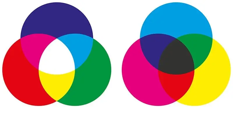
The RGB model is an additive while the CMYK model is subtractive.
In the RGB color model
In the RGB color model is so named because of its primary colors: red, green, and blue (Red, Green, Blue, in English), from which is comprised the rest. It is an additive color system, in which the colors should be added together to produce a new one.
The exceptions are the black, which occurs in the absence of light (and thus, color) and the white that occurs in the presence of all colors, recomposing the spectrum. This system is used in most tvs, monitors, computer, video projectors, etc
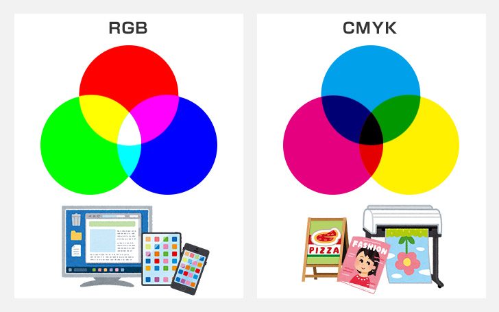
The CMYK color model
The CMYK model is different from the one before, but its name is also the union of the initials of the colors that takes as a reference: cyan, magenta, yellow (English: yellow), with the addition of black (so-called Key in English to avoid confusion with the B in the blue of the RGB).
This model includes the colour from the absorption of the light, so that unlike the RGB, is subtractive, subtraction of light: the mixture of all the pure colors (blue, red, yellow) gives the black, the total absence of light.
Besides, various colors side may be formed of this matrix, by varying the possible combinations of the three: cyan and magenta builds purple, cyan, and yellow builds green, yellow, and magenta builds the red.
This color model is used in the various printing techniques in ink, since the paper lacks the properties light of the monitors, or projectors. For this reason, when working in a digital program of design, you must convert the RGB to CMYK at the time of preparing the design for print.
What are the colors?
The color definition of Oxford tells us that the colors are the “impression that occur in the retina, light rays are reflected and absorbed by a body, according to the wavelength of the rays”. That is to say, the color is a result of the light and how we perceive the world.
Actually there are only 7 colors, also called color light, which you can find in the rainbow. The rest are called shades, or tones, or pigments. In this color model is based Isaac Newton.
Subsequently, the German scientist Johann Wolfgang von Goethe expanded and modified Newton's theory, making the model that we know today as the circle or color wheel, color circle or color wheel.
Color theory | basic Concepts of graphic design
Video support thanks to the channel “GCFAprendeLibre”
In this video basic Concepts of graphic design you will learn about Color theory to design, how to use colors to designs, how to use the chromatic circle, which is key, what is saturation, which is brightness, how to create colour harmony in design, what are the complementary colors, which are the analogous colors
The circle colour
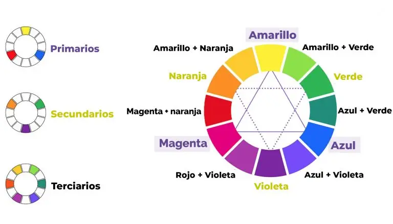
The chromatic circle is a representation circular colors arranged according to their relationship to each other. This concept is fundamental in the theory of color and is used in various disciplines, including painting. The color wheel shows the basic colors and their variations, allowing to understand the harmony and the combination of colors.
In the chromatic circle typical, the primary colors are placed equidistantly on opposite points of the circle: red, blue, and yellow. Between each pair of primary colors are the secondary colors, which are mixed from two primary colors are adjacent. These are green (a mixture of blue and yellow), orange (a mixture of red and yellow) and purple or violet (mix of red and blue).
In addition, you can add tertiary colors, which are the result of mixing a primary color with a secondary color. In total, the chromatic circle shows a full range of colors and their relationships.
This concept is valuable in the painting, because it helps the artists to understand how to combine colors in an effective way to achieve visual harmony in their works. Knowing the disposition of the colours on the color wheel, artists can create color palettes balanced and expressive.
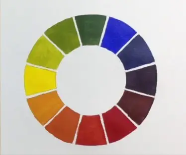
Color circle of 12 colors
How to make the circle colour
Video support thanks to the “Master Juan Manuel Santaella”
In this video you will learn how to make a color circle of 12 colors step-by-step, starting with the primary colors, learning to mix up my side and to get the tertiary. It is an exercise very helpful and interesting to learn how to mix colors.
Exercise
Materials Needed
The materials that we need are:
- Pencil
- 1/8 of white card stock or paper of 300gr.
- Tracing paper (carbon paper)
- Imprimer template (you can download it below)
- Paintings (vinyl acrylic colors: red, yellow and blue)
- Palette
- Brush
- Bowl with Water
- Cloth
Download the file to perform the exercise of the color wheel

Work Unit 3
Send us the result of your exercise in jpg format
Gurdar file in the following way:
Student's name – Circle Cromáatico Example: Edwin Salgado – Circle Cromáatico
Enviar el trabajo por nuestro siguiente formulario digital, especificando la Unidad correspondiente.
Todos los puntos del formulario son obligatorios. Tus trabajos serán mostrados al público en la exposición virtual de graduación en el metaverso al final del curso para los estudiantes que se certifiquen.

